Free Scripts on Tebex

FREE!


FREE!


FREE!


FREE!

Related posts

FiveM Server Branding: Logo, Identity and a Visual Style That Builds Recognition
In a list of a thousand 'Los Santos RP' servers, branding is how players remember yours. Here's how to build an identity that sticks — name, logo and a consistent style.

FiveM Community Moderation: Handling Reports, Disputes and Toxic Players Without Killing the Vibe
Every server is one bad moderation call away from a drama wave. Here's how to handle reports, disputes and toxic players in a way that's consistent, fair and keeps the city fun.

The FiveM Trust Chain: How Cfx.re, Tebex and a tebex.io Domain Fit Together
Keymaster escrow, Tebex payments and a tebex.io domain are one chain — and the domain is the link you can check before you pay. What a broken chain looks like in practice.
FiveM Server Sponsorships and Partnerships: Working With Creators, Streamers and Asset Makers
Most FiveM creator deals produce a 48-hour spike then nothing. This guide covers the three creator categories, how to structure deals with clear deliverables and editorial freedom, and the retention metric that tells you if a partnership actually worked.
FiveM Server Rules and Roleplay Frameworks: Writing a Rulebook Players Actually Follow
A rulebook nobody reads is just a liability you quote after the fact. How to write FiveM server rules that are clear, enforceable and structured so players actually internalise them before they break one.

Designing a FiveM Black Market That Doesn’t Break Your Server Economy
A black market that outpays legal jobs by 10x isn't an economy — it's a server killer. The three-layer design and demand mechanic that keeps crime exciting and money meaningful.

FiveM Server Artifacts Explained: Recommended vs Latest and When to Update
Half of 'impossible' FiveM bugs trace back to one number: your artifact version. What artifacts are, which channel to run, and how to update without a Saturday-night outage.
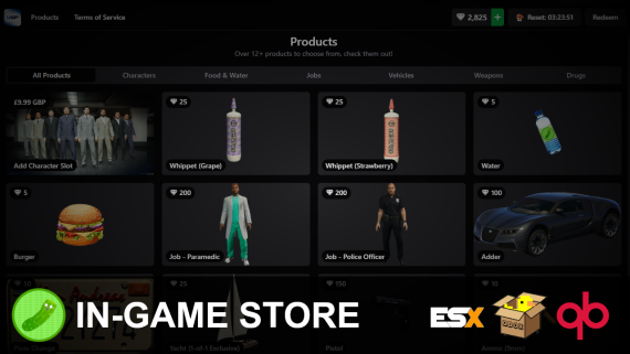
FiveM Monetization in 2026: Packages, Pricing and What Players Will Pay For
Monetization fails in two directions: stores that sell nothing players want, and stores that sell power. The package architecture that funds a city long-term.
The 2026 FiveM Server Owner’s Roadmap: Your First 30 Days
Most new owners do the right things in the wrong order. A 30-day roadmap that sequences framework, scripts, map and staff so launch day isn't chaos.
How to Budget Your First FiveM Server: Where Every Dollar Should Go
With a fixed budget and a hundred things to buy, order is everything. Where the first, the fiftieth and the two-hundredth dollar should actually go.
The 2026 FiveM Store Network Guide: Where to Find Scripts, Vehicles, MLOs and More
Where should you actually buy things for your server? A map of the specialist sister stores — scripts, vehicles, interiors, UI — and how to shop the network efficiently.

How to Build a FiveM Criminal Underworld: The Best Heist, Drug & Gang Scripts for 2026
The other side of the badge: a complete blueprint for criminal RP on FiveM — the best gang systems, drug empires, bank heists, street crime, money laundering and gang MLOs for ESX, QBCore and Qbox, including the free ones.